Vasyl Slobodian

Creating an effective pitch deck is one of the most important tools for getting a new venture off the ground. It can feel like an impossible task — especially if you lack design skills or are low on funds.
However, this guide demonstrates a detailed and reliable process to create a successful pitch deck without having to outsource the work. Remain in control of your project and influence investors to get on-board. Let’s get started!
Importance of a Pitch Deck
Take this scenario as an example, my friend Luke and I have been bootstrapping a brand new project called Kangarooo. It’s a mobile interface with travel guides as well as the ability to search local activities and even book them right on the app, created specifically for travelers in Australia. We launched the beta version of Kangarooo last July and over the next six months we built up a successful track record, which proved that our business idea was working.
To develop the product fully and to start marketing it, we needed money. Fortunately, there are many people and institutions that are willing to fund projects which seem likely to succeed, known as investors. But first they needed to be persuaded that giving money to our project was a good choice. A well-designed pitch deck is a highly effective tool to have in your arsenal for getting investors on-board.

Step 1. Define Structure and Create Content
A pitch deck is a presentation. And in order to create a successful presentation, structure and content are needed. There are a lot of sources on the internet which detail what elements should be included in a pitch deck. If one is short on time, I recommend reading this guide; especially Chapter 2: Elements. Another great, more detailed resource is the book Get Backed. Putting a generous amount time and effort into studying the art of raising capital is necessary for those who really want to succeed.
First, outline the overall structure for your future pitch deck, as explained in the previous guide. Then it’s time to write content for each element. This is a good framework to base your content creation process on:
- Title (e.g. Traction)
- Core Message: “We sold 90 unique tours and activities and earned $25,920 gross revenue within 6 months of the product beta launch!”
- 1–3 sentences with further explanation or supporting evidence: “$288 average transaction value; 20% repeat travel customers; $25 customer acquisition cost”

You should write content in bullet-points with a logical format and keep the amount of text as short as possible. Once you finish your writing, study it carefully. Ask yourself: How important is it to keep this particular item on the slide? Would the slide content still make sense without it? This process will cut down on unnecessary information that dilutes the power of your message.
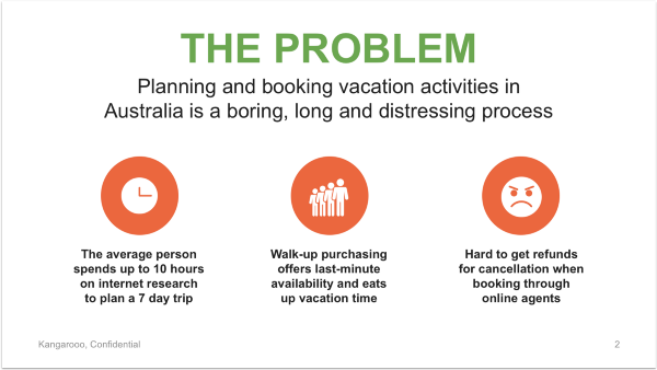
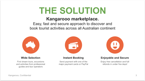
Take a look at the structure and content design for Kangarooo’s pitch deck. I laid out the core elements for Kangarooo pitch deck and filled each one with relevant content. Here is the result: http://bit.ly/kangarooo_deck_content.
Step 2. Develop Presentation Style and Template
To turn the core content into a design magic, an overall presentation theme is needed. A few key rules help the pitch deck look nice and clean. First, download this small, but super handy PowerPoint template that I’ve created for you: http://bit.ly/pd_template. Now, we will customize the settings for the main elements of each theme in the presentation, namely colors, fonts, and slide layouts.
COLORS
Open the first slide of the template. Insert your logo on the left or just type your company name if you don’t have one.
Next, fill the first two squares on the right with the main colors of your brand. If you don’t have any branding or need some extra colors, use this tool to get them. Keep the third square black since this color will be for the text. For those who don’t have any branding yet — congratulations, you just created a basic one!

After this you need to apply your brand colors to the whole template. Copy the color codes of your main and accent colors and then go to View → Slide Master → Colors → Customize Colors. Change Accent 1 and Accent 2 to your colors, click Save, and Close Master.
FONTS
Simple and reliable is best for this element. Just use Arial as the default font. It isn’t overly fancy, and it is well designed, super readable, and already installed on your Mac or Windows. The template you just downloaded already uses it so no action is required here.
SLIDE LAYOUTS
Slide layout consists of the design and placement of different elements on the slide. In this template that is: Title, Core Message, Further Explanation and Footer.
A Footer usually includes the company name or logo, confidential mark, and page number. The template we’re customizing now features the most used slide layouts in pitch deck design. The only thing you need to do is replace

Step 3. Design Your Pitch Deck
Finally some real design work for you! First, visualize the content using the presentation template along with a few common types of visual information.
ICONS AND PICTURES
Icons are one of the simplest ways to represent something visually. They are used in almost every aspect of life — from city navigation to website design. And of course they work great in pitch decks too!
Pictures are a slightly more difficult element. They are also a great way to illustrate something; but oftentimes it is not easy to find a good picture. Most of them will look too stocky or unnatural. If you can’t support your slides with natural, relevant photography — it’s just better to use icons.
One way to find icons is with The Noun Project. This website has a massive collection of icons and it’s free to use if you’re willing to include contribution links on each slide. I recommend just paying the $10 monthly fee and downloading any unlimited number of icons without any distracting links. You can also change the color of an icon and don’t need any additional software. To find pictures, use Shutterstock (paid) and Unsplash (free).
Most Suitable For: The Problem, The Solution, Business Model, Customer Acquisition, Team, The Ask


SCREEN SHOTS AND OTHER PRODUCT VISUALIZATIONS
Screenshots, mockups, and renders with a minimum description work best to briefly give an idea about your product.
Most Suitable For: Solution, The Product

CHARTS
Charts are the ideal way to present numbers. They show your audience what the data means and why it’s important.
Tip: When using charts, keep only the essential elements. For example, if you want to display data labels on each chart bar — get rid of data axis (Y axis). Make everything on the charts (data labels, etc.) big enough for good readability.
Most Suitable For: The Market, Traction, Financials, The Ask


TABLES
Tables are a simple and structured form of information organization. They help your audience quickly navigate through the content and are very useful when there is a lot of data to display, such as a financial plan.
Tip: Use Layout → Distribute Rows/Columns to make multiple rows or columns the same size.
Most Suitable For: Competition, Milestones, Financials

TIMELINE
The best way to give a visual for when specific events have happened or are planned to happen.
Most Suitable For: Milestones.

PUTTING IT ALL TOGETHER
Using the template and visual tools presented so far, here is the Kangarooo deck.
Note that for a Title Slide I’ve just put my company logo and tagline. If needed, add presenter name, contact and date below this. Overall the presentation looks good, however you may have noticed that some slides need to be cleaned up a little, and some are too boring. Let’s make them shine!
Step 4. Sharpen Up Your Slides
Here are a few design techniques that will help your slides look very professional and catching.
EMPHASIZE TEXT
On some slides you have certain information that is most important. To highlight it properly, use the following:
- Space. Give enough space to your important information. If it’s a phrase or a whole sentence, then give it its own row.
- Font Size and Effects. Make it bigger; use bold or italic effects.
- Color. Use accent color to highlight important text.
- Box or Frame. Pull out the important text into a frame or colored box. Make sure that the text is still readable and change the color (from black to white) if needed.


INCORPORATE WHITESPACE
Take one more look through your slides and identify those where the space between content is not even or not large enough. Fix it!
- Use the content frame from the template to make sure that your “supportive information” is formed along the slide and surrounded by enough whitespace.
- Rearrange content or make it bigger/smaller to fill the frame
- On slides where you don’t have a Core Message, ignore the frame and put even whitespace between slide title and footer.


USE IMAGES AND FILLED BOXED FOR BACKGROUND
Here is the final step in the fine-tuning process. My extensive experience as a Presentation Designer has taught me that a highly effective presentation is a proper mix of different backgrounds: image-based, filled and plain. There is no perfect formula for this mix, but here are a few guidelines:
- Use the following formula: 1 slide with image/filled background for every 2–3 plain slides
- Ignore the formula for slides that look too plain or simple and use an image/filled background to bring more life to those slides.
- It doesn’t really matter if you will use only an image background, a filled one, or a mix of both. Play with all the combinations and find the sequence you love.


That’s all! Here is what we get in result!
Looking good, don’t you think?
Note: Reading Deck vs. Live Pitch
I have one final thought to leave you with. It’s important to mention that we just created a reading deck (or slidedoc). This is the type of presentation that you will send to others to read.
For a live pitch you need to use a lighter version of your reading deck. A basic way to create a presentation for a live pitch is to take only the titles and core messages in the reading deck and see if the words give enough context to still understand what the slide is about. Fill in any details where absolutely necessary.
So there you have it. I hope this guide was a useful help for creating your own pitch deck. Don’t be shy to leave your thoughts about the guide or share your own ideas in the comments. Best of luck with your future presentations!
P.S. For more “pitch deck friendly” slide layouts and other helpful goodies check out BaseTemplates.
Find this article helpful?
This is just a small sample! Register to unlock our in-depth courses, hundreds of video courses, and a library of playbooks and articles to grow your startup fast. Let us Let us show you!
Submission confirms agreement to our Terms of Service and Privacy Policy.
Already a member? Login
No comments yet.
Start a Membership to join the discussion.
Already a member? Login